3 Questions to ask before choosing the size for your banner
So you’ve decided to order a banner, but have no idea what size to make it? Too small and no one will see it, too big and it will be overwhelming and ineffective. Answering 3 simple questions can help you select the right size for the job!
Who is your audience and where are they at?
Knowing whose attention you are trying to attract, and where they will be is vital to narrowing down the size of your banner. A banner that is seen from across the street needs to be a different size than the one that is from the other side of the room. To communicate a message over a long distance and over a lot of people, you’ll want to get a large banner with simpler design elements. If the banner is for people standing right in front of it, like a menu at a farmers market, then smaller text and more involve design may be more appropriate. Other elements to take into consideration – how fast is your audience moving (i.e. in a car, strolling in the park, briskly walking to work)? Are they moving towards, away, or parallel to the sign? Is there competing signage?
While it’s important that your sign attracts attention, like exhibiting at trade shows, fairs or community events, you should always obey any rules set down by the event management in regards to size and design. You will find that “bigger is better” when you’re competing with other organizations. In this case, larger signage is important to attract attention across a large space.
How big is your message?
Another way to ask this is “how long and complex is the information you wish to convey?” You need to decide what your sign or banner will be communicating, and then determine how much space is necessary for the text and/or graphics. While “bigger is better” applies to font size and banner size, “less is more” should be your motto when creating a take-away message for your banner. If there is a lot of information and it’s complex to read, you may need to work with a copywriter to simplify your message or lean more on imagery.
Shine On Signs’ design team can help you design a banner that does a good job communicating your message to a passersby, maximize space, and eliminate the need for redundancy, all of which will improve your banner’s effectiveness.
What’s the venue size?
Before you put up or place your banner, you have to ask, “Will it even fit on the wall?” If it does not – then that would be ineffective. Not only should you make sure your banner can accommodate your text and graphics, but you also need to know the size of the space where you plan to hang the banner/sign.
When it comes to size, you really need to avoid “eyeballing” it or “guesstimating”! If you haven’t ordered a sign or a banner before, it can be difficult to select an appropriate size. This is because it can be tough to visualize the actual dimensions of a finished product prior to seeing it up at the venue location.
In order to not over/underestimate the size of the space you are working with, you should do the following to avoid complications:
- Take measurements of the wall or area where you will be displaying the banner or sign. If you can’t take these measurements yourself, ask management to provide you with the numbers if you’re renting a space.
- Measure the distance from which you expect the majority of your audience will view the sign.
- Use a poster board with various sized letters, and test the readability at the venue. This way, you know what sizes will look impactful at that viewing distance, and then you can choose a variety of standard banner sizes that accommodate that font size.
- If you are still unsure about which size you should order, talk with one of our sign professionals. We can help you decide what size makes the most sense for your message, venue, and budget.
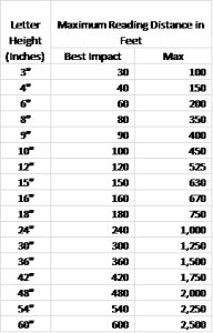
Sign Visibility Index
How big should the lettering be on your sign? It depends on lots of factors, but this chart provides a place to start. Remember that your sign’s visibility depends heavily on what the viewer is doing – if they’re driving by, then a sign needs to be larger than indicated by this chart. If they’re standing still with 20/20 vision and no obstruction (such as trees, cars or pedestrians), then this chart will suit.
Consider these factors that come into play with your sign; and rely on us to help you define the correct size for your needs:
- Letter style
- Color of letter and the color of the background
- Lighting conditions
- Road conditions
- Driver speed
- Familiarity of the design
- Location
- Indoor or Outdoor
- Eyesight of your target market
Our goal is to use the lettering size that delivers the impact you need at the distances your sign serves. A sign is a long-term investment in your business and its success, so it’s important to use a size that captures the attention of your prospects, referrals and customers.
Another factor to consider is brevity. The most effective signs have few words, and express them in large, clear fonts. When it comes to impact, less is more, and bigger is better.
At Shine On Signs and Graphics, we strive to provide a higher standard of sign options, and services that exceed expectations. Do you need more information for sizing your sign or banner? Call us at (253)243-7777 or email us at info@pugetsoundsigns.com. We look forward to hearing from you!

