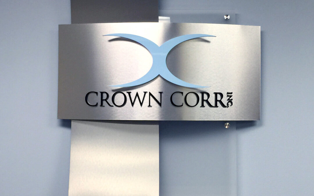
A lobby sign is important for any business, regardless of size and layout of the office; and there are creative ways to really make a statement. After all, it is the first impression someone will have of your business–and you want it to count. Here are 4 important things to consider when designing your lobby sign:
Design
Keep the layout of your lobby sign in good relation to the size and scope of your office. If you have an open, creative space, use your imagination for something that represents your larger-than-life ideas. If you have a more tight-nit, organized business environment, something more structured and geometric can show the clean, secure space that you provide for your clients and employees.
 Color
Color
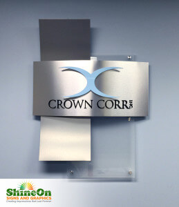
The colors you wear and use can reflect on you as a person: yellow for bright and cheerful, and blues for more calm and relaxed; and the same goes for your business. Aside from your logo (or in addition to), the colors you use for your sign can say a lot about the atmosphere people are entering. Do some research into the color palette and see which colors help say the best statement possible about your company and what you can provide.

 Font
Font
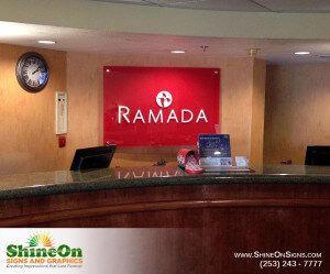
Font is a very important part of any design and can often be overlooked. It’s good to compare between Serif and Sans Serif when considering font and deciding which works best for your business. Serifs are generally used for lengthy text while Sans is used for shorter text, which can certainly apply to a logo sign. However, it is important to see what kind of fonts fits with your type of business, whether it be in banking or boating. Don’t be afraid to scroll through fonts and see every choice in perspective. You’ll be amazed to see that you will naturally react to some fonts better than others.

 Size
Size
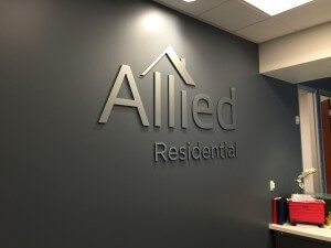
The last thing you need to consider is size. This goes hand-in-hand with design and font, and it’s important to find the right size for your lobby. You don’t want something that is too overpowering for your clients that may intimidate them as they walk in, but it should be large enough to create a statement and display your credibility as a business. It should catch anyone’s eye as they walk in. Overall, the size should be proportional to the size of your office and something that everyone can enjoy and appreciate as they walk through your door.

