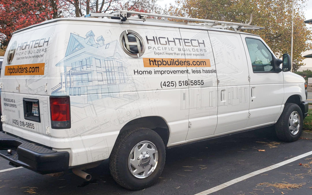
Ok, so you made it through Car Wrap 101 and realized “Hey, I should be wrapping my company vehicles!” Well now that you made that super easy decision, here comes the tricky part: how do you pick a design that gets you the most value for your dollar? What should you include on the wrap? We’re here to help! In Car Wraps 102 we look at the “no more no less” approach to maximizing vehicle wrap value through design!
Every car wrap design has 2 key elements: the Content (the bacon, lettuce and tomato if you will), and the Style (the bread on which the BLT is placed). Sticking with the BLT analogy, there are 3 main ingredients when putting content on a car wrap:
1. Business Name & Logo
This is the bacon- what it’s all about. Make sure your name and logo are bigger and more prominent than any other element on the wrap. You want people to easily recognize who you are, what your identity is, as it carries across all your signs, marketing, and print material.
2. Phone Number
If you don’t have a way to turn impressions into leads, you wind up with an expensive logo. Give your audience a way to get in contact with your company. A phone number is the best, and fastest way to let people get a hold of you (and easiest to track down the company online). Vanity numbers work exceptionally well on car wraps. If your company has one- use it.
3. Services or Products: 3 max
You need to let people know WHAT your company does. But, as you wouldn’t put 16 slices of tomato on your BLT, you don’t want to list all your products and services- stick to a maximum of 3. You’ve already taken up space and attention with name and number, so stick with the “less is more” approach. Short and sweet.
4. Website
If you like a little mayo on your BLT (I do), you can go ahead and add your website. Not a bad idea in today’s society with more millennials using website and email contact before a phone call. Keep it simple- no need to put www. – we all know that comes first. Get straight to the goods: ShineOnSigns.com.
Once you got all your fixin’s you need to make sure you have it all displayed on the right background. Not too plain, and not too busy. The design elements can range from IN YOUR FACE attention grabbers, to more subtle brand related schemes. Make sure the background design does not overpower and conflict with the message you are trying to get across. At the end of the day, no one eats a BLT for the bread.
For more information on creating your perfect car wrap, contact Shine On Signs. We have years of experience designing and installing professional vehicle wraps on all sorts of cars, trucks, vans, SUVs, trailers, and any other moving object. Now I’m off to make a sandwich!
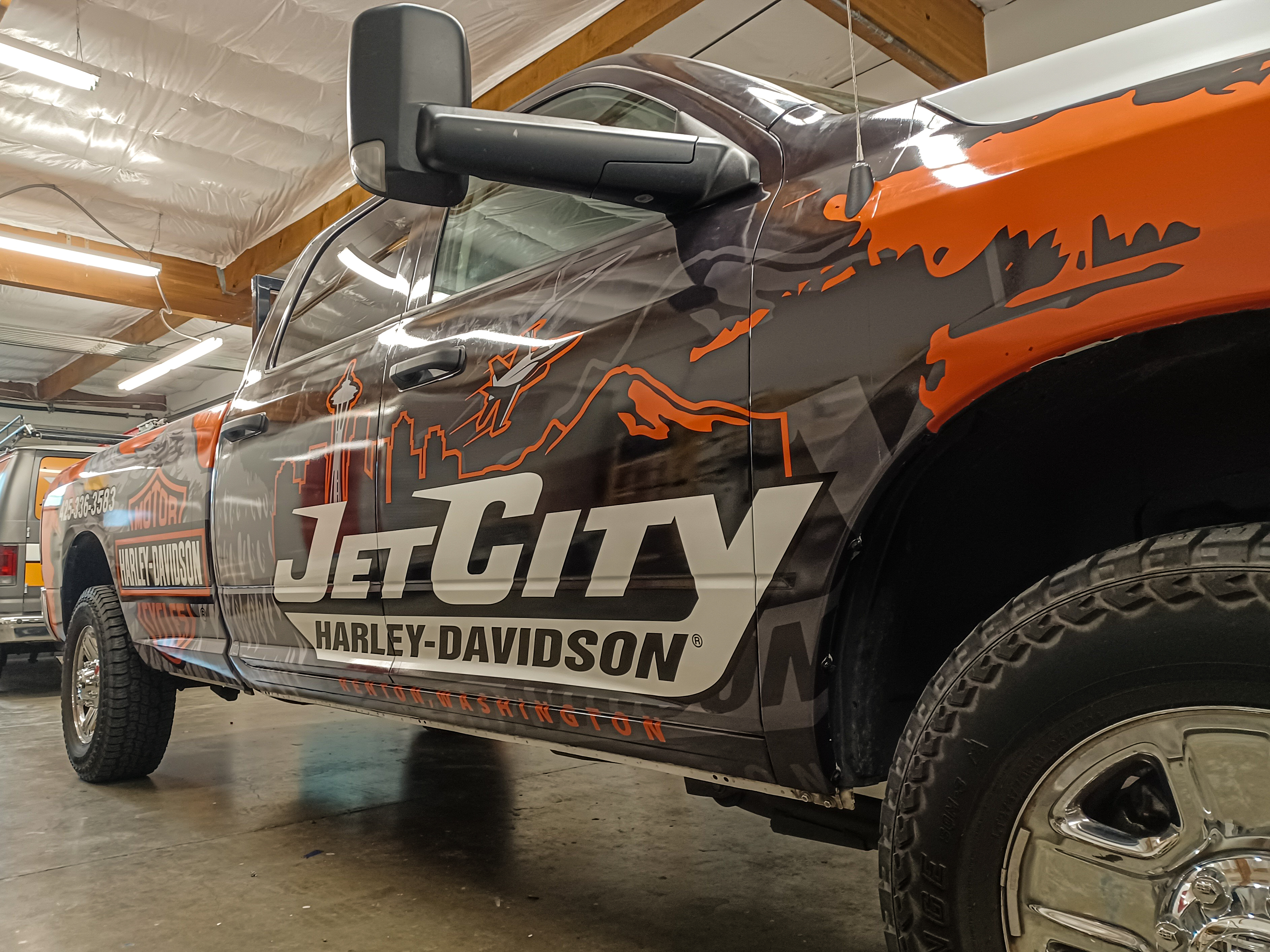
Jet City Harley Davidson – Renton, WA
Here is another wrap job we are excited to share with you! A trailer, a golf cart, and two trucks left here looking amazing! I will let the photos and video speak for itelf!
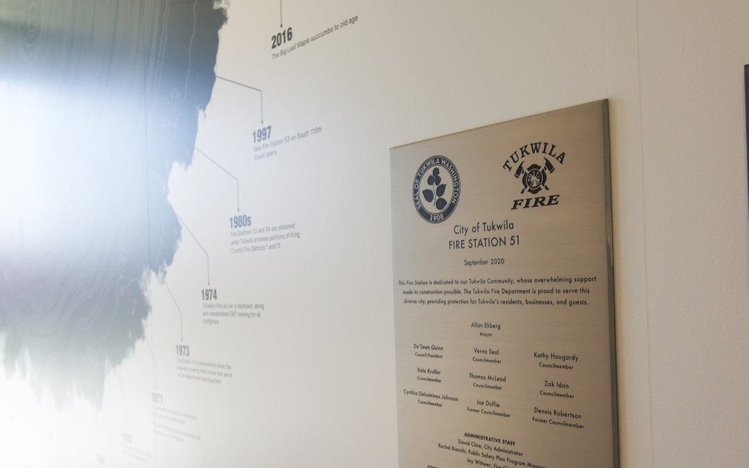
Tukwila Fire Station 51: Our Process
The Tukwila Fire Station is a great example of a full sign package. We were ecstatic about working on this project. Indoor ADA signs, a wall wrap, dimensional letters, outdoor illuminated sign, and a dimensional letter monument was on the order. Our team of...
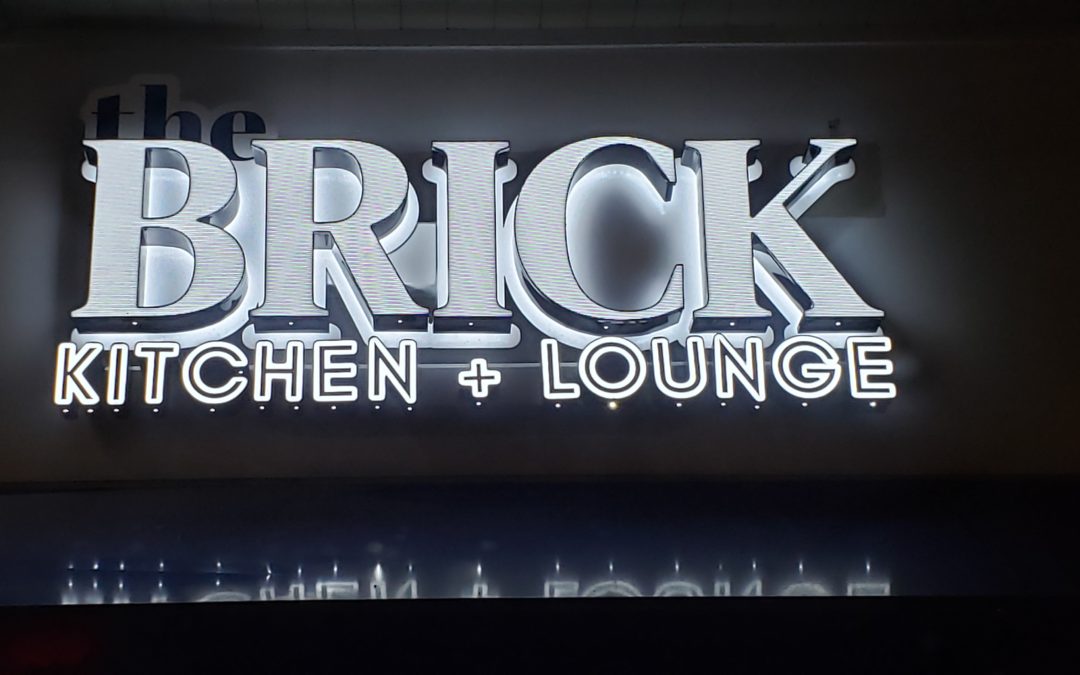
Illuminated Signs 101: Basic Terms
Storefront signage is one of the most important pieces to business. It acts as a way to locate the business. Shows the branding style and professionalism of a business. When illuminated they are one of the most powerful driving forces in attracting business during...
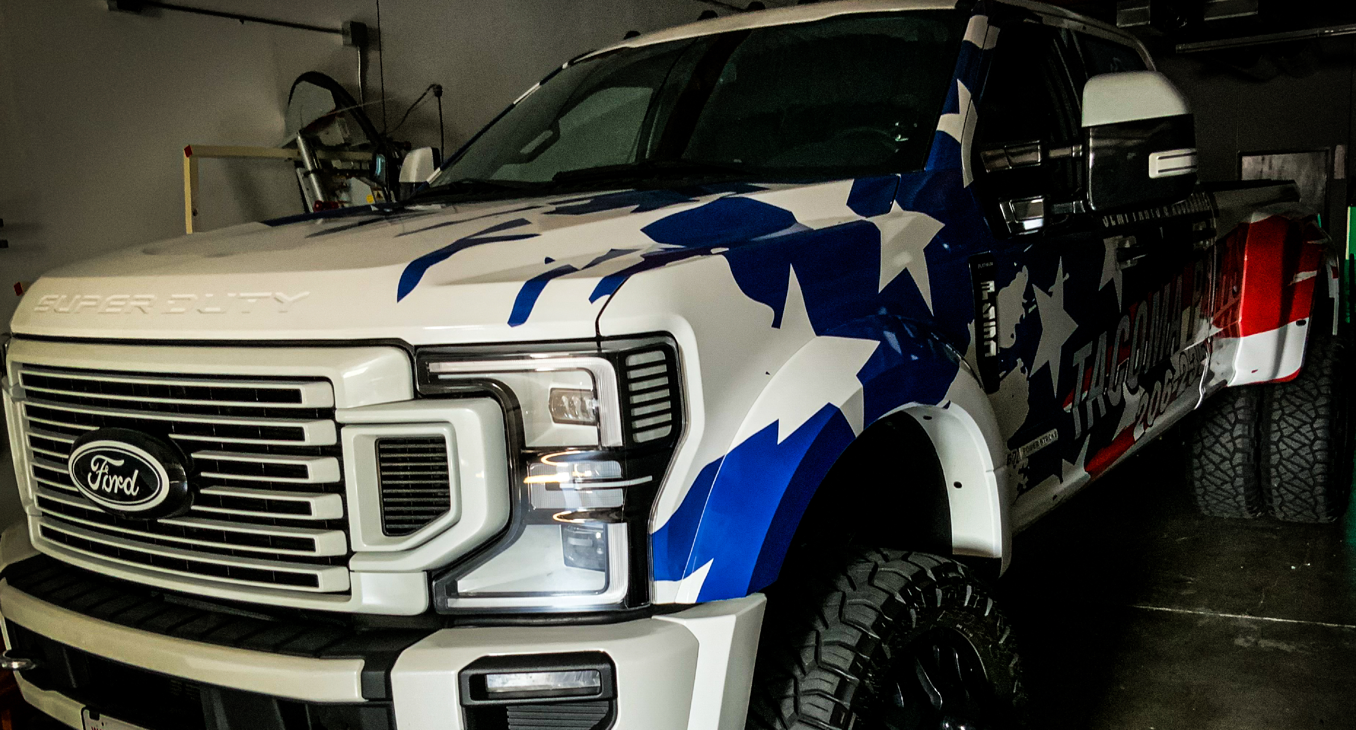
Tacoma Parts Truck Wrap
Tacoma Parts has been a long time friend of ours. They've had unique ideas for vehicle wraps in the past, which is why we were eager to hear what they had in store for us. After a conversation and taking some measurements of the Ford F450, a concept was developed. In...

